Go to Spungella for new posts.

> academyanimation is no longer active and serves as archives

Thursday, October 18, 2007

Critique - Bomb


Hey,

you nailed it! Great! You added all the elements that we talked about. I like the pause that you have after he cuts the wire and how he's happy. I remembered a version where the little hands come right after the cutting, but this works much better. Those little guys really spoil the party.

Like you said, the first part just needs more fleshed out acting in terms of struggling and thinking, but that's all. Show all of this in his face and little hesitation movement in his hands, but don't change anything major in the animation.

About the little hands. Might just be me but I would have them come out like you have it now, THEN do the little turn around (I would actually have them quickly clamp their little fingers twice), THEN go down to the wire and fix it. Let's see what the class thinks about it tonight.

Did you decide on an ending?

I still would have the lamp go on again with very quick blinking and him jumping out of screen, then the bomb explodes with everything in frame turning black and after a flash and that's how you could end your reel, with credits fading into the black screen.

But you're done soon though. I think we found all the major parts (except ending, kinda), so now it's polish time. It's a great clip, don't give up! :)

Cheers
JD

>>Click here to read the rest of the post...

Wednesday, October 17, 2007

Critique - Who Am I??!!


Alright, here some notes, old man first:

He seems pretty good although floaty til 182. Be careful not to have his arms or other parts of his body move like he was underwater or in space (for instance the turn away at around x145). Even someone who just stands there needs to have wait.
Make the inbetween poses as appealing as the main ones. Take x220, that seems a bit too big and unappealing for the old guy. I would keep his poses contained so that there is more contrast between him and the detective, even though the detective is soooo over the top, a contrast is a given :)
Put the detail throughout his whole body, including the fingers. x234 got a very extend thumb on the screen left hand and overall could be a nice pose (what's his attitude right now? Just confused? A bit angry? Probably both, so I would make him tense but not have full on fists for instance). He then gets very spliney/floaty til x321. Get off your chair and move exactly like he does and you feel how awkward it is. Act the old man out, film yourself (or someone else), observe grumpy/confused old people? How do they move? You also keep the hand poses (especially the his right with the extended thumb) throughout this time, give it more complexity.
Common mistake during x278 and x300, the whole upper body/arm/head part moves as one block, which looks very robotic. Same here, act it out, does that feel right? It happens before, from 250 to 270, but there the head is at least independent. Another one at around 380 to 390.
The floaty-ness continues with a very weird and slow body-down from 390 to 410, with his head stuck looking up, then absolut slow motion til x441.
Watch "Geri's Game" for reference of how an animated old man moves (even though your not "supposed" to look at animated stuff for reference), but again, act it out, find a friend who acts it out, ask your grand father, find an old hotel valet guy in the city, youtube, bbc motion gallery, movies, etc. Study reference for movement and timing.

Ok, detective guy.

Zoom out, or lower the camera, or move the detective up a bit (or further away), anything so that his foot is not cut off like that framing wise. It's an awkward start. Just tilt down with your camera, you have enough top space.
First pose on x0 is off balance (he'd fall to the left). So either move his body to the right or have him go immediately into the step towards the right so he's not staying in this pose for long. The pose itself is a bit awkward (mainly his right leg and how crooked the foot is). Stand exactly like him and you'll see what needs to get fixed because you'll feel how awkward that stance is.
Same robot movement feel like the old guy from x0 to x7. The whole upper body moves as one piece. Break it up. Think about what part of the body is leading? What is dragging?
Look at x34, that's also a weird pose. Yes, your character can be weird, but the poses still need to be appealing. The way you can't see his left knee and right knee and how the hand just hangs next to the right leg makes it at very weird silhouette.

[pic is coming, blogger is having problems]

The move towards the old buy is better. Watch out that you don't have things moving at the same time, the same way, like his feet at around x105.
The way he looks up in different spots is good because there are holds, it's not always moving.You might want to move out his right arm at around x154 for a clearer silhouette (so that the hand is not in front of the body). To make it read really well you would have to have the detective more screen right and not in front of the old guy. Imagine you would have just the black bodies in your shot (hit 7 in Maya for that) and look at how the two characters overlap. It would be clearer for the audience to have them separated. You have all that space on your right, there is no need composition wise to have them that closely (easy way to move them apart is to move the old guy to the left, so that you don't have to redo the steps and placement of the detective, there is less to do on the old guy).
Again, check your poses for the rest of the clip. Take x204, the way his hand is rotated back hurts. You also have to get in there and get rid of that default finger position, pose your character all the way at this point.
During the steps back avoid overextension of his legs.
From x238 to x246 for instance it's too much of going from pose A to pose B, everything moves at the same time. Would you move like that? Same with x265 to x273 and the forward bend after that. His swing is too fast during the x300+ part. It's okay in layout and blocking (even in blocking though you should flesh out the timing), but so far into the animation process it looks too cartoony (the rest of the movements seem pretty realistic, so that part stands out as "wrong"). Act it out, time it and change your animation accordingly.
Form x310 to x380 everything is constantly moving, hold a few poses (for instance at around x362 for the "Ha!").
The end is muddy as well. Check x383, he looks like a twisty tie :) That pose needs to be clearer and more appealing (and his foot is sliding), same with x422+.
The quick movements after that also have weird inbetweens. Plot out your arcs, give the animation some rhythm, really work on your poses. During fast action like that you will have to go in there frame by frame. Something like his right foot at x431 should not be in there (you need to rotate the foot down).
The roll is also messy, that needs a lot of clean up, especially foot contact (your feet are sliding all over). And really work on thought out hand/finger poses (get rid of his default hands for your next revision).

Phew, lots to do. :)
Keep going!

>>Click here to read the rest of the post...

Tuesday, October 16, 2007

The Keys to Getting a Job by Pamela Kleibrink Thompson

update: this post has now been translated into Italian! You can read it at animatorspot.com

Disclaimer: I haven't seen any notification that taking notes and posting screen captures of this
lecture are forbidden. If so, please contact me first before taking legal actions. ;)


I wanted to write down the main points of the Demo Reel Siggraph video "Resumes and Demo Reels" (link to video is not valid anymore; if anybody can find the clip online, please leave a comment) by Pamela Kleibrink Thompson, because it's good stuff. Make sure that you watch the video as well.

Obviously when she mentions that you should divide your reel into sections, like character animation, modeling, logos, etc. it might not be relevant to you, if you are applying for a full time character animator job. But overall it's a great and very useful lecture.

Here's her contact information:

Pamela Kleibrink Thompson
The 911 Recruiter/Career Coach
Ask about the Career Navigator Program
www.linkedin.com/in/pamelathompson
http://www.facebook.com/PamRecruit
https://twitter.com/#!/PamRecruit
Career Coach column at http://mag.awn.com

------------------------------------

You are a product, a unique individual and you need to package yourself. The marketing tools for that are:

- Resume
- Portfolio
- Demoreel

Main objective is to get an interview.

The invisible resume and the most important marketing tool though, that starts with you entering the interview room or classroom, is your reputation. Attitude is a key factor. People within your company will move to other jobs and referrals are a big part of recruiting. You want people to remember you in a good way. A fantastic resume and reel will be useless if someone doesn't want to work with your personality.

When you start at your first job, have enthusiasm, go the extra mile, be a problem solver, don't complain, follow directions, give ideas and contribute, etc. It's all a matter of attitude.

Once you get that interview the people want to find out 3 things:
- are you willing to do the job (that's your attitude)?
- can you do the job (although that's obvious looking at the reel and resume)?

and most importantly:

- will you fit in? Are you a team player?

You need to convince them. Do your homework, research the company you are applying for, be prepared.

------------------------------------------------------

"Make it Easy for the Recruiter." - Recruiters are generally overwhelmed, they have to do a lot of sifting through resumes. But their job is to find the right person and they know their company. Don't just hand your reel to your friend at the company, but go through HR as well. They know about project openings that your friend doesn't. Better safe than sorry.

"You spend a lot of time agonizing about your stuff. Do you know how much time they spend looking over your stuff? Probably about 5 seconds." Due to high volume of resume/reel submissions, your work has to stand out, otherwise your resume ends up in the trash and not in the "to be called" stack.

Resume Checklist:

Contact Info at Top
- Phone Number > Current area code & Voice mail or answering machine
- Name
- Email address

- Large, legible type font
- Easy to read
- Not too much type
- List skills
- Highlight accomplishments (this is your time to brag)
- Single page > If multiple pages, contact info on other pages too

-
Proofread (it will land in the trash otherwise)
- Goal/objective > What you want to do (important if changing careers)

Be specific
- No "variety of 3D packages", because companies use computes that scan for certain keywords. So if a company is looking for Maya animators and the recruiter is scanning through all the resumes with that keyword and it's not on your resume, it won't pop up.
- make sure that your resume copies well (dark paper will make it hard for the type to read; don't use parchment paper, etc.)

She shows great Sample Resumes with Gray Scale Art obscuring the Contact Information, hard to read and crowded fonts.
In short:

- Test your resume - fax, copy (legible over several generations)
- Color (no orange, dark blue, purple)
- No marble/-parchment paper
- No gray scale
- Attach artwork
- Review and update every 6 months
- Update when information changes
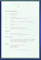
Good resumes are easy to read and have plenty of white space. Simple, clear and concise. (shows sample)
The structure would be something like this:

NAME
Telephone*fax*email address*web address
OBJECTIVE (be specific)
SKILLS
*Bullet points
EXPERIENCE (Include accomplishments)
EDUCATION

(funny story about an Amblin intern who used to walk Spielberg's dog, which is a little mutt; cracked me up because the rumor is that Shia's name is Mutt Ravenwood and he's Indy's son. So Indiana is named after his dog and now Indy's son is named after Spielberg's dog! The circle is now complete. Oohkay... anyway.)

Resume via email:

- Don't send resume as attachment (fear of viruses).
- Send resume in an email message as text.
- Don't email from work or use work email address on resume.
- Don't expect employer to visit web site to view or download resume (make it easy for them, don't give them extra work to do)

--------------------------------------------------------

Cover Letter Tips

List:
- Personal connection
- Common ground
- Referral
- Advantage

3 to 5 paragraphs long

- Cover letters are:
> A sales tool. Part of the marketing package.
>Often not read, especially if they are too long.

- Cover letters should be:
> Short and to the point.
> Specific and clear.
> Easy to read.
> Addressed to someone specific.

- Use cover letters to:
> Clarify what you are offering the company, if it isn't clear from your resume.
> Indicate career change or clarify special circumstances or skills.

- If one page resume, copy double sided with cover letter
> "See my resume on back of this cover letter."

She lists areas that need artists. Mentions Consumer Products (Packaging & Advertising) as a very steady and sought after position.

-----------------------------------------------

Demo Reel Do's

- DVD (now primary media over VHS otherwise 1/2" VHS (NTSC for U.S. Companies))
- Web sites (ask first if company will look at it)
- Check DVD before you send it (on different machines)
> PC & Mac compatible
> Autoplay [after checking with recruiters, they do NOT encourage autoplay, just have a simple menu that says "Start Reel" or something, because it's irritating to them when the reel starts automatically and they are not ready]

- ALWAYS include a resume and reel, breakdown/credit list with your reel
- Clearly label your reel and reel breakdown with your name and contact info
- Best, most recent work first (funny story about that)
- 3 minutes or less
- One shot can get you hired

Make sure you watch the video for the examples and stories (about the one shot reels for instance).

- Focus on your strengths
- Demonstrate your abilities and creative talents
- Show a variety of work
- Customize your reel to the job and company you are applying to, if possible. (you might need multiple reels)
- Include a head and tail slate with your name and contact info, especially email address.

- Divide your reel into sections: "Character Animation", "Modeling", "Logos", etc.
- Update reel and portfolio every six months
- Remove old work, even if you love it (another funny bit)

"Most times people will spend about 30secs on your reel. If they don't see something in those 30secs you're out of there."

You're going to be judged on the weakest piece in your portfolio.

Professional Presentation
- Screen shot on label or outside wrapper: memorable image of your work.
- Include the screen shots with your resume: separate sheet attached
- Package yourself
- Details matter
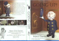
Video shows nice DVD wrapper example, matching DVD with DVD label (CONTACT INFO on wrapper, DVD itself, etc.).


- Include life drawing or other fine art work such as sculpture, painting or photography at the tail of your reel.

---------------------------------------------

The Breakdown - also called Credit List or Shot List

- Always include it with your demo reel.
- Be clear.
- A short paragraph for each shot on the reel is plenty of information
- Be precise and consise.
- For example:
> Segment 2: "Wizard of Oz" film, animated witch melting with Software A and hardware B for company C

Information to be included:
- What was your involvement with each piece? Explain exactly what you did for the shot.
- What project was it done for? > Film, game or TV?
- Where was it done? > At which company? Personal project at home?
- What tools did you use? > Hardware and software
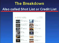
Movie shows "Breakdown List Sample". (surprised they liked that one, looks like too much work - the second one is cool though with thumbnails for each shot and a little description).


- Put slates before each shot or superimpose description on shot (subtitle) (I see subtitles more than slates, that way the reel is not too long)
- Students often work on group projects
> Student should specify what he did on each shot.
> If student did everything, say so in the breakdown.

------------------------------------------------

Demo Reel Don'ts

- Never send masters or originals.
- Don't put your best stuff last. The viewer may never get to it.
- Don't do a chronological work history.
- Don't include early tests.
- Don't include mediocre work.

Focus on the Visuals not Audio.

Kiss off loud, obnoxious music or elaborate sound.

- Color bars are not necessary nor countdowns
- Don't expect prospective employers to view samples or a resume on a web site. A lot of companies will look at it, a lot won't. Ask first what they prefer. Main rule, don't ask employer to do any extra work, make it easy for them.
- Don't send the exact same reel in 6 months. We have very good visual memories.

Companies have reel review sessions and there are dedicated people who take notes and log comments about your reel. All the notes are collected and put into a file, that file grows and there are notes about how you improve and at a certain point you are called "Hireable". So when your skill set matches their openings you will get a call.

Your Demo Reel will not be returned.

- Minimize erotica, satanic and violent material.
- Don't include live action film without animation or computer graphics
- Don't send work in progress.
- Don't ask for feedback by phone. (if you're lucky to get feedback, pay attention, don't argue, don't be defensive, take notes)
- Don't shrink wrap your reel.
- Don't email images as attachments. Fear of viruses.

Don't take it personal if no company calls back, there could be many reasons.

- Don't put tutorial exercises on your reel.
- Don't embed images in email unless you have permission. Slows down downloads.
- Don't wait until a conference to submit your reel.

At Digital Domain, they get 30 to 40 reels in a normal week. When they advertise or post a job, they get around 300 to 400 reels. At Siggraph week, they get between 3000 and 4000 reels. Think about that. It's going take them a while to go through the reels. So if you don't hear from them immediately, it means that they may be reviewing reels still. It's going to take them about 3 months to get through all the reels, that they see at Siggraph. Now some of them will do it more quickly, because some of them will just fast forward through your reel. Really quick. After all the agony you've done making sure that your reel is the greatest it ever could be, they might spend 30 seconds on it, possibly, if you're lucky. They are going to fast forward it and see if there is anything that catches their eye. That's why you need to make sure that your best stuff is up front, ..." Grab them right away. Some companies will bring back the reels from Siggraph and watch them properly, over the course of time, others will just fast forward through them in their hotel suits late at night.

Why are companies even coming to Siggraph with their big expensive booths? Why collecting all those reels? Because there might be one or two or three out there that we really want to find. So they want to hire you, they are looking for you. You just have to make it easy for them to find you.

Start sending your reel in December. Or for students right after graduation in April or May.

More Demo Reel Tips:

- Be impressive, not excessive.
- Keep it short and sweet.
- Always include breakdown.
- Always label with contact info.
- Quality matters.
- Your demo reel gives the viewer a look into your brain -- how you solve problems.

There is no magic formula. It's just hard work and persistence and networking.

----------------------------------------------

Jobs in Visual Effects:

- Modeling
- Texturing
- Lighting
- Animating
- Compositing
> Small companies want generalists
> Large companies want specialists

Shows different demo reel examples of modelers, texture artists, lighters (Lighting and Compositing combination skills are very popular and a double threat)

- Animation, Ringling Student Reel, now at EA, less than 2min long short film (most student reels lack weight). It's not just about jumping and walking or pushing something, it's about personality. - funny though because one of the first things you see are breasts (made out of wood though), the clip is funny and towards the end clearly sexual (the audience laughs), but it's not disrespectful and the response is positive, so I guess she got away with it. :)
continues with compositing, fx artist, etc.

A lot of times the sound is off during reel reviews (except during lip sync animation clips).

For Riggers, show the rigs moving, not static.

--------------------

Conclusions:

- make it easy for the recruiter, package yourself well, be flexible, be ready to take chances, take risks.
- Content is what counts
- What matters is the work
- Nobody cares how old you are or what school you attended
- What makes a reel great? If your work can be cut into the company's work seamlessly, that's great.
- Show the very best you can do
- Show off your skills
- Show you are capable of doing the work

Your most valuable marketing tool:
- The Invisible Resume
- You start building it in school
- You build it on every job
- Your reputation is most important
- Make sure it's stellar

Don't burn any bridges.

She tells a story about someone screwing up big time, getting on "the list" by just not showing up at work for his first day, because he decided to work for another company. But he didn't call the first company to tell them that he's not going to show up. Big mistake.

-----------------------------------------------

That's it, the Q&A is not on it. Lots of good stuff tough otherwise, you should print it and make a little book out of it. :)

>>Click here to read the rest of the post...

Free Siggraph Movies until Oct. 31st

"Get full access to over 1100 video presentations from SIGGRAPH 2003, 2004, 2005 and 2007!"

The "Sketching Facial Expressions" is an interesting concept. I would love to see a version in the future which would a Jason Schleifer type Greasepencil input within the 3D app, which will allow the user the draw out poses in 2D that affect and pose out the 3D model, or where you look through the render cam and draw poses on top of the cg character and it adjusts the poses accordingly. I would assume that it gets very tricky and distorted because of the 3rd dimension, but it would be cool nonetheless.

Other good clips from the 2007 presentation could be "Resumes and Demo Reels: If yours don't work, neither do you!", "Anyone can make quality animated films!". I'm going to watch a few of these. There's also "Crossing the line: Moving from Film to Game", tons of simulation stuff, character animation, scary sounding stuff like "Data-driven Efficient Production of Cartoon Character Animation", etc. etc.

>>Click here to read the rest of the post...

"Myopia" returns

Good news! Keith Lango is resuming work on his long lost short movie "The Secret Joys of Myopia". I'm all for non-photo real animation!

>>Click here to read the rest of the post...

Flooby Nooby

Holy moly, what a great post by Jeff on his class blog (which you guys should check on a regular basis). It's a link to "Flooby Nooby", which has the following notes:

The full dossier of Eric Goldberg's notes.
250 pages of sketches and writings about
posing, timing, and animation techniques:

Bill Peet's notes on contrast,
persepctive, line density, rhythym,
and composition for any illustrator
and story sketch artist:

Brad Bird's notes on compostion - Part 1:

Brad Bird's notes on compostion - Part 2:

Chris Roman's notes on storyboarding:

The art of thumbnailing for
story artists and key animators:

A newly compiled version of
Walt Stacnfield's Gesture Drawing for Animation:

Effects Design - Full list of notes and
techniques for classical FX animation:


Holy cow, the printer is going to explode! Great find Jeff!!

>>Click here to read the rest of the post...

Friday, October 12, 2007

Pixar Zoetrope

This thing is just too COOL! What about a smaller handheld version, with just one character, sold at Disney stores. I'd totally get it. Here's another angle (shorter clip though). - found @ Cartoon Brew

>>Click here to read the rest of the post...

Strong Hand Poses and Contact

Those pictures are from the new CG "Ten Commandments".


Take a look at the hands/fingers. Please make sure that you don't have default finger/hand poses like that in your work. This is kinda a repost, but you can't research/study hand poses enough. Make sure to look at Angus' drawings, check out comic books or do a google search, you will find very strong poses (not just for hands, for instance Tennis and Football). Find inspiration where ever you can.

Also, look at the feet (in the first pic), they don't seem to be really grounded on the floor. Make sure that your contact points are solid. not just with feet, but on hands, or whatever you have that should convey contact and weight. Even if it means tedious frame by frame work. Davis' cowboy on-his-knees clip is a good example.

I know it's a cheap shot to point out stuff like that, there might have been tons of reasons why the poses look so generic, I'm just using it as an example, so no need to write me an angry email.

>>Click here to read the rest of the post...

Critique - Jello


Alright, the "teacher" works great during the push-off-desk. The gesture on around x110 for "Who did this?" is a bit broad, it's very "Tataaaa, look at that." You can lessen the arc, where it's a very matter of fact A to B (with a little arc though). I would keep that pose with some life to it as he looks back to the kids (the hand to the chest is very even in terms of timing and slow). You can then go to the folded hands as he starts walking
The walk needs some work, it needs more weight and character, right now it's very still (whole body with arms and head are moving as one), loosen up the upper part. The screen right leg around x206 is doing a weird swing, where the knee is pointing screen right and then moves in with an opposite pose at around x214. Lessen the out and in of the knee.
On "I'm gonna loose..." his bending down to the kid is too big, tone that down because you want the full explosion happening with the other kid. Straighten him up as he says that line. He's stiffening up, preparing for the jump, then make the jump a bit faster and have his head always looking at the kid (with a little nose down for the overlap on the land, but not too much). On "mind" you can have him get closer to the kid to accentuate "mind".

The right kid looks okay idea wise, just put polish on it. The left guy shouldn't look at the other kid because it distracts from the teacher, the audience should always be looking at him. The kid can look at the other one at the very beginning with a tiny head rotation towards him, nothing big.
With FK/IK switching you either match it frame by frame or make the switch happen across a few frames.

Cheers
Jean-Denis

>>Click here to read the rest of the post...

Thursday, October 11, 2007

Critique - TNT and Martial Arts


First off, the TNT clip:

I can't wait to see the final version (love the foot traces as he slides back - how are you going to make them visible? Are they just geometry, little spheres?).

The main thing that sticks out is his facial expression around x188. At the beginning of the shot, before he bends down to pick up the box, you see him screaming. That expression needs to be while he throws the box and clearly visible at x188, a scream of power and desperation, hoping that the box is far away enough.
There is something about that pose pause around x190 to x200. I would add some overlap or continuing acting with his body. Right now it seems like he pauses for a bit in order to go to the shocked expression at x209. It's a bit too pose to pose.
Speaking of x209, I would offset the arms in terms of posing a bit. At x209 (during that section) both arms are stretched out and down. I would take the screen right one and move it up a bit (see image), give it more negative space between the chest and the upper arm.
I'll take a look at it at home for a more detailed critique.

Again, the foot traces are great, now you need to add little touches like that to the set. Give the walls some character (don't have them be straight lines for instance), same with the boxes and the ground. Keep going, nice work!

The martial arts one is coming along nicely. One part that stuck out was around x176 where the poses could be stronger.
As you get further along, add some detail to the foot when he holds the pose at x40 (right now it's pointed up with the same rotation throughout, you could tense the foot more right before he goes into the next action, or relaxe it a bit, just keep it alive). Same with the head, it feels locked.
Would be cool to add some breathing or strong inhale/exhales during certain moments, gathering his strength before the next salve for instance.

Hope that helps!
Cheers

JD

>>Click here to read the rest of the post...

John Nevarez

Take a break from animating and check out John Nevarez' blog. There are lots of really talented artists out there with fantastic blogs, which can be really inspirational in terms of posing, design, composition (like Gabriele Pennacchioli's one-drawing story), but I always visit John Nevarez' blog, because not only do you get to see what he's up to, you also get posts with TONS (and I mean TONS) of links to other insanely talented artists.

The variety of artwork is great, you get really inspired to create unique characters and to place them in powerful backgrounds. Sometimes there's just a very strong hand/finger pose, or the interaction between multiple characters or the composition using a small and a big character, a certain facial expression, etc. etc. but there is always something cool.

It will take you a long time to go through all the posts and links, but whenever you have time, start your journey into holy-moly land.


>>Click here to read the rest of the post...

Wednesday, October 10, 2007

Does your browser crash?

I'm using Quicktime 7. 2 - Firefox 2.0.0.7 - Flash 9,0,47,0 - on 4 different systems (different configurations), Firefox 2.0.0.3 and Mozilla 1.7.7 at work, nothing happens. If anybody finds any solution, please let me know.

UPDATE:
Jeff (THANKS!!!!) posted this in the comment section:

...actually there's a new quicktime bug that crashes all browsers, that happens every time it updates itself. try this...go into..

quicktime
quicktime preferences
advanced
direct X
disable enable directDraw accelleration, secondary monitors, and video accelleration.

all should be well.


------------------------------------------------

So, I asked around and no one is having browser crashing problems except my students (which sucks because you guys really need to be able to read the posts). Here is a reply I got from a "tester" which might help:

They can try emptying their cache.

MAC

Clearing Cache on Firefox 2.0 for Macintosh

1. Open Firefox.
2. Click the Firefox menu and select Preferences.
3. Click the Advanced icon and click the Network tab.
4. Click Clear Now under the Cache section.
5. Click the "X" in the top left corner to close the Advanced window.
6. Exit and re-launch the browser.

Winblowz

Clearing Cache on Microsoft® Internet Explorer 7.0

1. Click Start and select Settings, then Control Panel.
2. Double-click Internet Options.
3. Click the General tab.
4. Click Delete under the Browsing History section.
5. Click Delete Files in the Delete Browsing History dialog box.
6. Click OK.
7. Click Close.
8. Close and relaunch your browser.


Clearing Cache on Microsoft® Internet Explorer 6.0

1. Click Start and select Settings, then Control Panel.
2. Double-click Internet Options to open Internet Properties.
3. Click Delete Files.
4. Click OK on the Delete Files dialog box.
5. Click OK.

Clearing Cache on Firefox 2.0

1. Click Tools and select Options.
2. Click the Privacy icon.
3. Click Clear Now in the Private Data area.
4. Click Ok.
5. Exit and relaunch the browser
-------------------------------------------------------------------------

Also try flushing your DNS cache.

open a command line in windows. Start > Run > (type: CMD)
in the DOS terminal type:
ipconfig /flushdns


So, give that a try.

>>Click here to read the rest of the post...

Tuesday, October 9, 2007

Blocking Stages

For some curious reason I've received numerous emails from students expressing their dissatisfaction with their clip, even going as far as stopping to work on it completely (curious because they all arrived pretty much at the same time). All of them were in the blocking to blocking+/polish stages, where the main ideas are in it, but not all the details.

If you have a clip which is very subtle, the basic blocking might look very boring to you (that happens even with action pieces btw.). Don't give up, trust your instincts. If you liked the idea at the beginning, hold on to it. It's normal that you get bored or frustrated after seeing your clip a hundred times. Work on a 2nd clip to change your ideas and to keep a fresh eye.

Sometimes the "wow" factor lies within the polish. Just make sure that the foundation, the blocking, is in place and go from there.

Justin Barrett has an interesting breakdown of his Puss in Boots clip, from acting reference to final polish. There is even a clip with 4 stages shown at the same time. Read through his breakdown here.

>>Click here to read the rest of the post...

Animation Mentor: Advanced Work-flow - Two Medium Approach

Another article in the current AM Newsletter is "Advanced Work-flow: Using A Two-Medium Approach" by Kenny Roy. He says about this method:

Simply put, TMA is the practice of switching between hand drawn and CG animation, whenever one method offers a better way to overcome an animation obstacle.


It's interesting to see that this work-flow is being covered right now. A few days ago there was a post on the Spline Doctor's blog, which started as a 2D animation software recommendation. They mention that students should learn 2D animation before tackling the 3D version of it. The comments to the post mention an AM work-flow involving 2D and 3D animation. So go through those comments and you'll end up with tons of useful links about 2D software.

But back to the main topic. The work-flow is not for everyone, since basic drawing skills are a minimum. It's all about saving time and getting to your animation as quickly as you can, so bypassing a complex rig and drawing your poses can be great. But if you can't draw at all, you might take the same amount of time. Just go through the Pros and Cons he lists and you'll see if this method is for you.
There are also clips that illustrate the method. It's definitely an interesting approach and you should at least try it. Greasepencil by Jason Schleifer is also very cool, a script that let's you draw inside Maya.

>>Click here to read the rest of the post...

Animation Mentor Fall 2007 Student Showcase

Alright, ready for a big piece of humble pie and a refill on motivation?

Stop whatever you're doing and watch the AM Student Showcase 07.

It's fantastic and humbling to see how high the bar is now in terms of student work.

Perfect example up front, Nathan Engelhardt's Body Mechanics clip with the cave men. It could just be a weight assignment, but there is so much that makes this clip stand out. First of course, the animation. It's very well done and funny, the emotions are clear and the character seems alive. There is also interaction with the set, as he pushes away his tools during the struggle.
The 2nd guy adds humor to the whole "exercise" and gives it a little story. Also a good incorporation of a cycle (with some extra tweaks to disguise the cycle).
The composition is clear. Even though the character is right smack in the middle of the frame, the emphasis is on the stone, which occupies most of the left screen half. He's standing in front of the sky, which makes his silhouette clear, there's nothing busy behind him.
It's not just an empty space, it's an actual location and the character is part of it. He's wearing his little loincloth. The landscape is not just flat, it's a bit uneven where he stands, there are hills and rocks in the background and stones and bones in the foreground. Nice touch how the foreground and background are out of focus, adding depth to the scene.

All of this doesn't require any technical skills (besides the animation mechanics of course). There are no crazy modeling skills necessary, this should all be doable.

The visual icing on the cake are the textures. The stone, the landscape, the exaggerate form of the clouds, beautiful. The lighting works also very well.
The rocks and the sky could be taken from an image and not be actual geometry. But the realistic stone texture makes it all work together and nothing stands out as out of place.

But that "little" extra requires skills beyond animation and basic modeling. I would always spend the extra time on animation. When you feel that the animation works and you have free time, then you can work on the extra visuals.

Either way though, this is what students do, that's the current level.

As you continue watching the reel, you start to wonder if all the students took extra texturing classes, since all the sets look very nice (even the snow on the 2nd clip). :)

Another fantastic clip is the two character interaction one by Shad Bradbury. I've always been waiting to see a clip like that (since most clips online are about one or two characters talking). This one shows a great feel for weight.
The struggle of the little guy lifting/pushing/pulling the heavy one is great, but I'm actually always watching how the heavy one moves. The way the body feels heavy and squishy is great. A bit cliche maybe but to push it further you could put those characters in a warzone or some environment which makes it clear why he's pulling his buddy. Yes, it's the desert and he wants to help/save him, but a more interesting set and maybe interaction with it would have been top notch.

There is a lot more in that reel, so please check it out, it's well worth the time.

>>Click here to read the rest of the post...

Critique - Walk & Run


The walk:

Front view: your body is missing the left/right translation. So let's say during x10 (and of course for the other side as well), his weight needs to be over the screen right leg. Right now your body just goes up and down.
The head could also use some stabilizing, right now it swings with the body left/right. If you pick the middle part of the head, it should more or less stay in the middle with some overlap, but your head swings from left to right a lot.
The right arm more so than the left one hits a wall towards x32/x1. It does an outside swing, then comes in a bit until said frames and hits a wall for a few frames. Make sure that the arc continues throughout the loop.

Side view: the feet are sliding, it looks like they snap down and backwards, slow down, then accelerate before the lift off.
There is a hiccup in the spacing on his left arm, it seems to slow down around x10, then speeds up again.
The hands are too early in terms of drag and overlap. Look at x32, the arm just finished its backward swing yet the hand is already rotated back (delay that by 2 or 3 frames and I would actually lessen the rotation a bit).
His head could use a bit more nose up/down, when the body goes up the head drags a bit with its nose down and vice versa on the down.

The run:

seems good except one major thing: there is a giant snap during frames 1 to 2 and 15 to 16, as if he got hit by a giant hammer!!

:)

>>Click here to read the rest of the post...

Animation Mentor Newsletter - Oct 07 Issue #27


The new Animation Mentor Newsletter arrived yesterday and I hope everybody signed up for it.

The highlights are:

The 11 Second Club revealed!
- AM is now sponsoring the site and the future looks bright!

"The Briefcase" short by Jimmy Almeida - I met Jimmy and he's a very talented and funny guy, same goes with his animated short. Make sure to check it out.

Profile on Dave Burgess
- Dreamworks Feature Animator

Profile on Megan Hobby
- AM Alumni

There is more, but they warrant their separate posts. Check out the links and sign up for the newsletter if you haven't already.

>>Click here to read the rest of the post...

Strong Poses and Planning

According to Jeff I "started this instructor blog craze" :) and I'm glad when other teachers are adopting this method (I doubt I "started" this method though). Whatever it takes to give students the most help they deserve.

And now that I'm checking out Jeff's animationaac blog, I'm glad he started the blog. He has a great link to Elliot Roberts' blog, which has a great post on strong poses.

He also has a super sweet outline for planning your shots from Clay's Animation Podcast site. Absolutely go check it out!

>>Click here to read the rest of the post...

We Were Centurions

Go to wewerecenturions.com and watch the clip. I feel bad for complaining about something (I hear my own voice going: Well how about you create a finished short instead of criticizing), but here it goes. This is (to me at least) an example of too much gesture acting, less would have been a lot more. If you characters have limited facial features, there is no need to act everything out with your arms/hands to compensate for it.

>>Click here to read the rest of the post...

Monday, October 8, 2007

Critique - "Jello"


This works a lot better, nicely done. If there is a way to put the screen right student more into frame, that would be good, so he's not that cut off.
The hands are fine, but as you get into a more refined stage you can add more business to them, instead of them just being cupped together, not too much, it's nice how it's a bit contained before the outbreak, plus it lets you concentrate on the character's face. He could hold his hands together, rub them a little bit, relax the hands, stuff like that.
At the end, when he screams at the kid, I would have him look straight into his face, not looking down the way it is now.

Basics are blocked out, now you can put all the good stuff in it! Can't wait to see it!

Cheers
Jean-Denis

>>Click here to read the rest of the post...

Banner