Go to Spungella for new posts.

> academyanimation is no longer active and serves as archives

Tuesday, February 12, 2008

Acting reference

I'm trying to watch at least one movie a week and from now on I want to find cool moments in a movie in terms of acting or any other type of reference that would be helpful or inspiring to you guys.
So no matter what style or quality of a movie, something usefull has to be in it. This is easy to say and I'm already struggling with it... For instance "The Kingdom" had a great overall performance by Ashraf Barhom who plays Colonel Faris Al Ghazithe, but not a single moment that you could easily pick apart (at least I had an easier time with "The Illusionist" for instance). He was just good in general, just like Anthony Hopkins is always a joy to watch.

Be warned that I will mention plot points when needed in order to give you some sort of context, so spoilers are inevitable.

What I have almost ready are the following movies (some movies might get listed due to other notable filmmaking qualities besides acting):

The Illusionist
Star Trek Nemesis
Disturbia
Flyboys (plane animation)
Die Hard (acting & staging)
The Quiet (cartoony acting)
We Own the Night
Lost - Season 1, Ep. 1 & 4
Flawless
The Price is right (TV)
Life - "Did you feel that?"
Miracle at St. Anna
True Blood "First Taste"
The Master

More to come.

Shawn Kelly got a cool webinar about how to use video reference.

>>Click here to read the rest of the post...

VES Awards

Congratulations everybody! Of course there were many other winners, check out the whole list @ Hollywood Reporter

Best Single Visual Effect of the Year

"Transformers" (Desert highway sequence)
Scott Farrar
Shari Hanson
Shawn Kelly
Michael Jamieson
---------------------
Animated Character in a Live Action Motion Picture


"Pirates of the Caribbean: At World's End" (Davy Jones)
Hal Hickel
Marc Chu
Jakub Pistecky
Maia Kayser
---------------------
Animated Character in an Animated Motion Picture


"Ratatouille" (Colette)
Janeane Garofalo
Jamie Landes
Sonoko Konishi
Paul Aichele


>>Click here to read the rest of the post...

Prelude to Eden

I thought I posted this one here before (or at swench) but either way, check out Michel Gagne's "Prelude to Eden". Saw it again @ Cooked Art

>>Click here to read the rest of the post...

Monday, February 11, 2008

Wall-E thumbnails by Victor Navone

Head over to Victor Navone's blog for his Wall-E thumbnails. Thanks Regis for the tip!

>>Click here to read the rest of the post...

Sunday, February 10, 2008

Annie Awards

The 35th annual Annie Awards took on a new level of laughter this year in an event that successfully combined prestigious awards with huge menu of comic relief, and most everyone was in a grand mood. Winners trotted to the stage to deafening applause and cheers with a couple of standing ovations thrown in. It was by far the most fun I’ve had at the Annie Awards. It seemed it’s time has come, and is fully embraced by the industry as the ceremony where frivolity looks great in animation black.

Read on @ cgsociety

>>Click here to read the rest of the post...

Critique - Walkcycle


About having both views in one movie:

You would have to import both movies into after effects and put them side to side. At least that's how I do it. Or you import your animation into the same animation and then you have two identical guys in there. Move one aside and rotate it 90 degrees. But I think the AE method would be faster.

If anybody has another methods, let us know in the comments.
------

I assume that the arms haven't been animated yet, so let's look at the rest.

First of all, that character freaks me out! :)
Those eyes in the front view, holy moly!!

Anyway. Let's start with the body. The up and down seems good but I would delay the hips. (frontview) From x0 to 3 the hips are already going up on the right side. His full weight would be on the foot starting at x3 and as he pushes himself up the weight shift would happen. So have the hips level out at x3 and then go up into what you have at around x7. Same goes for the other side.
In the sideview it look like your hips are rotating back (let's take x0 to 3) a lot, whereas from frame 10 to 14 or so, as the foot travels backwards a lot, the hips don't really rotate anymore. Make sure that the hips are not disconnected from the leg action.

Your feet need adjustment in terms of timing. The moment the foot steps onto the ground it has to travel backwards (sideview) at the same rate. So the curve of your foot has to be linear from touchdown to liftoff.


Look at your foot from x3 to x4. Little movement back. Then x4 to 5. Big movement back. Then x12 to 13 it's smaller again. At that point it's actually slowing down to a stop from x14 to 15. From 15 to 16 it's moving forward! Then from 16 to 17 you have a giant change with the foot being on the ground with curled toes to completely off the ground. Use those extra frames when it slows down and stops to add more inbetweens so that the foot has a nice lift off the ground. There's good reference for that at this site:

www.sabudesign.com
(thanks Chintan!)

Another quick shape change happens from x17 to 18 as well as from x23 to 0 where the toes are curled down and then fully up. You will have to make this transition a bit smoother by adding at least one more frame between the pose changes, because right now it makes the feet look very floppy (and the shoes look actually pretty hard and sturdy).
Don't overstretch your leg during the passing poses at x8 for instance (you can see that the heel is off the ground).

Looking at the head (sideview) it feels like the timing of the overlap needs to get adjusted. Have the head be down around x5 already (the impact of the foot planting and the body stopping to go down will influence the head down movement). At x13 the head would be a bit up because it's dragging. 16 or 17 it would be down again because of the impact of the step, etc. etc.
Frontview: the head does a quick screen right movement from x9 to x12. It looks like the body rotation is taking the head with it, so adjust the overlap there.

That's about it. Go ahead with those notes.

Cheers
JD

>>Click here to read the rest of the post...

Friday, February 8, 2008

Reel Review by Rhythm & Hues

Got this email today:

Rhythm & Hues will visit the Academy of Art University on February 21


Company Overview & Presentation

Thursday, February 21

10:00 am

491 Post, Morgan Auditorium


Select Portfolio Reviews

Thursday, February 21

1pm-4pm

3rd Floor, 180 New Montgomery


To be eligible for Portfolio Review, you must submit a demo reel according to the guidelines below. They are seeking Seniors in all Animation areas (modelers, animators, VFX, etc.)


Demo Reels must be:

No longer than 2 minutes in total length

Submitted on DVD with a case

Labeled with Student Name, Student #, Phone, Email


Submit demo reels to either:

Animation Admin Office, Room 301, 180 New Montgomery

or

2D Animation Lab, 2nd Floor, 540 Powell


Submission Deadline:

Friday, February 15 at 5pm

>>Click here to read the rest of the post...

New Wall-E Trailer

Looks soooo good! Better quality here.

>>Click here to read the rest of the post...

Critique - Bouncing Balls with obstacles


Cool, I like the complexity of the shot. The balls need some work though.

Let's look at the yellow one:

The initial jump up due to the heavy ball crash is a bit high, I'd reduce that by 50%. The ball also falls straight down but then bounces to the left. I would add a little piece of the black pole that fell right were the yellow ball hits the ground. The little piece should be angled so it makes sense for the ball to bounce to the left. Look at the image to see what I mean (hope it's clear).


The bounces are good, but again, it doesn't make sense that it would bounce back to the left at x50. So after the yellow ball hits the heavy one at x45, keep the bounces going to the right (it could roll off the black ground at the end). Also reduce the amount of distance it travels. The impact at x50 is a bit too far to the right, go around 70% of that distance.

Heavy one:

Break the black board during the first bounce. Make the first bounce faster (like the second one), it could also roll a TINY bit to the left or right, give it some tiny life after the bounce. The falling is also a bit even. Look at the position of the ball at each frame and make sure that the distance gets bigger and bigger.

Light one:

The first bounce up is very poppy. The spacing gets huge from x10 to x11. Reduce that spacing, which will have the ball not go up as high, which is okay.
Just like the yellow one, add a little broken piece so that it makes sense for the red ball to bounce to the right. The bouncing/floating feels good, but here as well I would keep the bounces going screen left after it hits the heavy ball. Don't switch direction at x171. Yes the black ground is tilted but it would only lessen the amount of travel to the right, it wouldn't change the direction that drastically.

Keep going!
JD

>>Click here to read the rest of the post...

Critique - Bouncing Balls


Ok, what you have going here are linear curves in your graph editor.

The balls go up and down in a very robotic way, there is no weight to it.

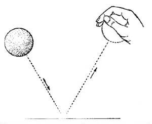
Look at the image with the two balls and the hand. See how straight those two lines are? I figure your curves look like that.


You need to have them like the other image with the rounded curve. Your Y curve in the graph editor needs to look like that.


Check out this site for great reference.

Basically as the ball falls down it accelerates. So the spacing needs to grow from frame to frame. So as it falls down there is bigger and bigger space between eye key/position of the ball.
The opposite happens as the ball goes up. As it bounces up it will slow down and the spacing will get smaller and smaller.

- pic source

>>Click here to read the rest of the post...

Animation Mentor Newsletter - February 2008


If you haven't done so yet, sign up for the Animation Mentor Newsletter (free of course) @ animationmentor.com

This month you get:

Tips & Tricks by Shawn Kelly (a must read - if you're new to this, go through the Tips & Tricks Archives as well)

Video Games Triple Play
- Video Game Reel Tips
- Animating for Video Games
- Game Developers Conference

"The Park" short film by Roger Gimenez

Jason Schleifer - Mentor

Mark Behm eCritique for the 11secondclub

Animation Podcast - James Baxter

Bobby Beck's Blog

Student - Teresa Nord

>>Click here to read the rest of the post...

Thursday, February 7, 2008

Critique - Weight


Good start, now you have to do a couple of things.
For presentation there is no need for the split screen, I'd prefer a bigger render.
Scale down the car, it seems pretty big. If you are unsure, then place Hogan inside the car like a driver.
Next I think we need to adjust the camera a bit. Looking at frame 50 or 60 the car is pretty chopped off framing wise, it would be neat to have it fully in frame.
You want to make it clear to the audience what's going on. Since you're working on one shot, you dont' have the benefits of a sequence, people don't know what happened before.
First viewing you see the guy ducking, but you don't know where he is and if the ducking is positive or negative (he could be sneezing, he could look for something on the ground or actually try to cover himself), so like you said, you should add a street, maybe sidewalk or something similar.
Then suddenly the other guy jumps in and then suddenly the car is there. It's all a bit confusing (imagine people who've never seen it). At the end you understand what happened and having the element of surprise when the hero saves the day is a good thing, but let's try to built up the tension, let's milk the moment of the bystander thinking he's going to get crushed.
Zoom out a bit so that the car is more in frame. Maybe add a shadow over teh bystander (some flat geometry with a half transparent shader on it simulating the car shadow). You can then make it bigger and bigger. That way we know something is coming, it's getting big, it's about the crush the guy and then the hero steps in and saves the day.
Now we need to figure what the bystander is doing. Why is the car flying and falling where he is. Who did that? If you had giant imprint of a creature's footprint, that would explain things. With Cloverfield released, it might not be very original, but something similar within the set explaining what's going on would be cool.

Animation wise the hero traveled quite a distence. You don't want to get the sticky landing spiderman feel. Even though he has superpowers, there's still gravity. Is he jumping that far or flying? Right now it's looks like a jump. Have him land and then take a few steps to absorb all the weight.
Wow about this (just thinking/writing out loud, no need to do it like that): The victim (standing pretty much at the center of the frame) is next to a sidewalk which has a wall right next to it. Victim looks up, gets scared, shadow grows from a dot to fullsize, showing that something is falling towards the guy. He tries to escape by taking a few steps onto the sidewalk but is blocked by the wall (ends up more screen left towards the end of frame). In jumps the hero (with those few steps added as mentioned) and gets ready to grab the car (a bit off centre favoring screen right). Car lands and pushes the hero towards the guy on the wall (so the car fall is more horizontal then vertical) but he stops sliding before hitting the victim (adding a bit more tension, "will they make it?" type of thing).
Hero then throws away the car the way you have it. Looks back in a "You're safe buddy." look and jumps/flies away with the victim looking relieved, or fainting or something like that.

Again, just throwing it out there. But it would be neat to have that shot be it's own little story.

>>Click here to read the rest of the post...

Wednesday, February 6, 2008

Critique - Walk


Very cute!

Two things that struck me first were here arms (frontview), how they shoot out seems a bit too poppy, especially the screen right one from x2 to x4. It looks more like she's pushing people away. The sideview looks good, so I would reduce the outside pushing or give her more time for the swing, don't do it over 2 or 3 frames.
The other thing is her head. But in the front and sideview it feels to poppy, there are a lot of abrupt movements which gives her a bobble head feel. Look at x4 (sideview) how the head suddenly goes up til x6, then from x8 to 10 it suddenly goes down. Reduce the sudden rotation and give the overall body up translation two more frames to easy into the highest point, that will also get rid of the sudden stop and pop feel.
The legs feel good, I would just get rid of the leg pop from x9 (bent) to x10 (straight) to x11 (bent again). Same with the other leg.
If your rig allows it, take her eye aim controller and pull it away from her, so that she looks at a steady point. Right now as the head rotates her eye direction is also changing.

Nice work!

>>Click here to read the rest of the post...

Tuesday, February 5, 2008

Nick Pitera

There's another interesting post @ Cartoon Brew. This time the focus is on Nick Pitera. Head over there to check out how he sings both the male and female parts of "A Whole New World". Crazy!
The post also points out to Nick's blog and guess what, he's an animator at Ringling. Multi talented indeed, nice!

>>Click here to read the rest of the post...

"Faking it" by Amid

There's a great post at Cartoon Brew with a quote from Kevin Koch (Dreamworks Animator) which you should print out and always carry with you. :)

“If you’re not in a position to make story/character contributions, if that superficial character and shallow, unbelievable story aren’t going to improve no matter how many suggestions you make, then just do the best you can. There are times when I have to remind myself that I’m a pro, I’m being paid to do a job, and the least I can do is a solid professional job. Think of those shots as a technical problems. Look for ways to emphasize the basic principles of animation. Are the arcs as full as they could be, can you pack in a touch more overlap and follow-through, are your poses as clear and well staged as they can be? If you’re stuck having a minor character walk around for no particular reason, make it the sharpest walk in the movie, without upstaging the main action. Remember the oft quoted line, “There are no small scenes, only small animators.”

>>Click here to read the rest of the post...

I love animating.


Do you guys ever get that feeling where you suddenly realize how much you love something?

I have that with multiple things. Obviously there are moments where I could just eat up my wife and kid because they are so awesome and cute.

Or when I watch a movie on my projector on a 120" screen. I'm telling you, you never get used to it. And there's always a point during pretty much every movie where you realize how big that screen really is and how cool it is to watch movies like that.

The list can go on but a minute ago I had that same "Holy crap do I love this stuff or what?!" moment while animating on Indy. I can't believe that's a job. I just love it.

Just had to share that, sorry... Move along, nothing to see here! - pic source

>>Click here to read the rest of the post...

Art Babbitt's "Animating Art" part 1

Check the "related videos" for the rest of the doc.


found @ Cartoon Brew

>>Click here to read the rest of the post...

Monday, February 4, 2008

Critique - Balls


You named the clip "beach ball" but the balls feels a bit too heavy for a beach ball. If you'd call it a "medium" ball, I'd say fix the beginning of how the ball enters (it falls down straight but then bounces to the right - you need to have the ball on an arc the moment it enters frame) and then you're done.
But if you're going for a beach ball then you need to slow down the bounces a lot. Your timing for a medium is okay, so you could get away with just scaling the keys. ;)

The "light" ball looks good, there are only a few tweaks. I would add one more frame at x41 to x42. The spacing is good but one frame before impact there is a sudden increase in speed, your spacing gets too big. Same with the up bounce on x42 to 43 and the down on x54 to x55 (the up after that is fine).
Once the ball hits the wall you have one frame of compression which could work, but right now the compression from x62 to 63 is pretty small, then the ball speeds away from the wall at x64. I'd take that one frame of the compression and use it as a way to ease into the bounce away.
Check your curve on x69, the ball looses its momentum for a frame and doesn't travel enough screen left. If you step frame through it you'll notice a weird little jiggle. Use the dry erase marker at each frame and track your ball, you'll see the uneven spot of your arc. Overall I would lessen the amount of distance the ball travels after the wall hit. I think it bounces too far. Also, add another little bounce after x82 (at your current animation, once you lessen the distance it won't be at this frame anymore of course). Right now it bounces and then suddenly sticks to the floor. I like how it bounces off the wall. Once you changed the distance though it might not reach the wall or not hit it as hard, so that little bounce might get a lot smaller or it might even not be necessary.

The heavy one is too light, the bounces are too big. I like how you added the wall though, but once you'll adjust the bounce, it won't travel as far screen right. I would look at the first clip on this page for reference:

That ball really feels like a bowling ball. Try to get the weight looking like that.

Keep going!
Jean-Denis

>>Click here to read the rest of the post...

The Art of Making Pixar's Ratatouille

THE ART OF MAKING PIXAR'S RATATOUILLE
© 2008 Ron Barbagallo

Pixarplanet points to a great article @ animationartconservation about the making of Ratatouille.

Speaking of which, a friend of mine showed me the Blu-ray features of Ratatouille on his HD projector and holy moly does it look fantastic (both the picture and the features).

The animation is just so insanely well done, holy moly indeed. You should rip the DVD, convert the movie to quicktime and then go through the whole movie frame by frame. :)

>>Click here to read the rest of the post...

Sunday, February 3, 2008

Banner